# UmiJS + Storybook 搭建组件库文档
我从 Storybook 6 开始关注 Storybook (opens new window),它是一个很好的撰写组件库文档和测试组件的工具。Storybook 号称是零配置,适用于任何现代前端框架。但是外面的世界还是太复杂了,有各种不同技术的组合,比如我最近一直在使用的 UmiJS 4 (opens new window),它对各项技术进行了自己的封装。这篇文章我们实现在 UmiJS 工程里使用 Storybook 搭建组件库文档。
这是我写的关于 Storybook 的第三篇文章,前两篇分别是
- Storybook,介绍 Storybook
- Storybook 搭建组件库文档,搭建自己的组件库文档,当时使用是 Webpack 4 + Storybook 6.5
在我学习 Storybook 的过程中,Storybook 从 6.5 升级到 7.4,再升级到目前最新的 8.5,Storybook 的功能越来越强大,越来越好用。
# 实现效果

# 安装
$ npx storybook@latest init
当前版本 8.5.3
Storybook 将根据您的项目依赖,为您提供最佳配置,主要完成:
- 安装依赖包,比如
@storybook/addon-essentials - 添加 script 命令,比如
"storybook": "storybook dev 6006" - 创建配置文件,在
.storybook目录下,有两个文件main.(js|ts)和preview.(js|ts) - 创建示例,在
src/stories目录下
Storybook 默认生成的 main.ts 如下:
// .storybook/main.ts
import type { StorybookConfig } from '@storybook/react-webpack5';

const config: StorybookConfig = {
  stories: ['../src/**/*.mdx', '../src/**/*.stories.@(js|jsx|mjs|ts|tsx)'],
  addons: [
    '@storybook/addon-webpack5-compiler-swc',
    '@storybook/addon-onboarding',
    '@storybook/addon-essentials',
    '@chromatic-com/storybook',
    '@storybook/addon-interactions'
  ],
  framework: {
    name: '@storybook/react-webpack5',
    options: {},
  }
};
export default config;
2
3
4
5
6
7
8
9
10
11
12
13
14
15
16
17
18
stories,定义哪些文件是 storyaddons,使用哪些插件,Storybook 是基于插件工作的。这里注意一下@storybook/addon-webpack5-compiler-swcaddon,后面有讲到。framework,Storybook 使用的构建工具,因为我们使用的是 React + Webpack 5,所以这里使用的是@storybook/react-webpack5
后面我们可以添加更多的 addons 以及添加 Webpack 等配置。
Storybook 默认生成的 preview.ts 如下:
// .storybook/preview.ts
import type { Preview } from '@storybook/react';

const preview: Preview = {
  parameters: {
    controls: {
      matchers: {
        color: /(background|color)$/i,
        date: /Date$/i,
      },
    },
  },
};

export default preview;
2
3
4
5
6
7
8
9
10
11
12
13
14
15
这里定义了一个全局的参数配置,参数名带有 background 或 color 的使用颜色选择器控件,参数名带有 date 的使用日期选择器控件,后面我们还可以参加更多的参数配置,以及全局 Args、Decorators、Loaders 等
# JavaScript 编译器
UmiJS 的技术栈是 React + Webpack 5 + TS + Less,但是不确定 JavaScript 编译器用的 Babel 还是 SWC?
这篇文章 SEE Conf: Umi 4 设计思路文字稿 (opens new window) 说 JavaScript 编译器用的是 SWC

但是 UmiJS 的文档 (opens new window) 上写的是 Babel。
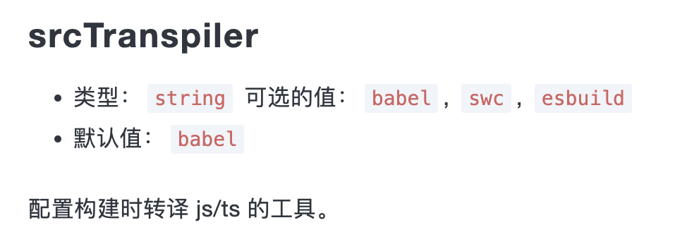
JavaScript 编译器关系到 Storybook 使用哪个编译器 (opens new window)。如果您的项目使用的是 SWC,则使用 @storybook/addon-webpack5-compiler-swc (opens new window) 插件,如果使用的是 Babel,则使用 @storybook/addon-webpack5-compiler-babel (opens new window) 插件
从上面 Storybook 默认生成的 main.ts 中我们可以看到,Storybook 以为 UmiJS 使用的是 SWC。其实根据我的研究,UmiJS 应该使用的是 Babel。
我也不能确定,因此我在 Umi 的 GitHub 的代码库里提了一个问题:请问 UMI 默认使用的 JavaScript 编译器是 Babel 还是 SWC (opens new window),期待他们的回复。
因此需要安装 @storybook/addon-webpack5-compiler-babel (opens new window) 插件,卸载 @storybook/addon-webpack5-compiler-swc (opens new window) 插件
$ npx storybook@latest add @storybook/addon-webpack5-compiler-babel
$ npx storybook@latest remove @storybook/addon-webpack5-compiler-swc
2
修改配置
// .storybook/main.ts
const config: StorybookConfig = {
  addons: [
-    '@storybook/addon-webpack5-compiler-swc',
+    '@storybook/addon-webpack5-compiler-babel',
  ],
};
2
3
4
5
6
7
# Typescript
不知道是不是 UmiJS 隐藏了对 Typescript 文件的处理,Storybook 无法编译 Typescript 文件,所以我们只能修改 Webpack 配置,添加 TS 文件的处理 rule。
$ npm i typescript ts-loader -D
import type { StorybookConfig } from '@storybook/react-webpack5';
import path from 'path';
import webpack from 'webpack';

const config: StorybookConfig = {
  webpackFinal: async (config) => {
    if (config.module && config.module.rules) {
      config.module.rules.push(
        {
          test: /\.(tsx?|jsx?)$/,
          loader: 'ts-loader',
          options: {
            transpileOnly: true,
          },
          include: [
            // 限制范围,避免处理 node_modules
            path.resolve(__dirname, '../src'),
            path.resolve(__dirname, './'),
          ],
        },
      );
    }
    return config;
  },
};
export default config;
2
3
4
5
6
7
8
9
10
11
12
13
14
15
16
17
18
19
20
21
22
23
24
25
26
# 样式
前端处理样式的工具有很多,比如 Sass、Less、Tailwind、Styled Components 等。对于大部分工具 Storybook 都提供了相应插件来处理,详情请查看 Render Component styles (opens new window)。
UmiJS 使用的 Less (opens new window) + CSS Modules (opens new window)。Storybook 提供了@storybook/addon-styling-webpack (opens new window) 插件。
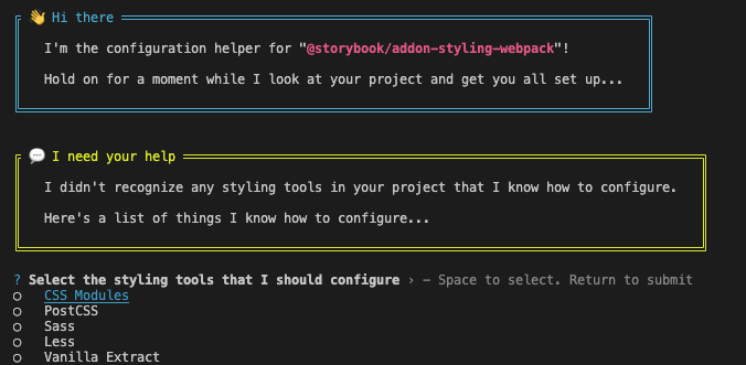
# @storybook/addon-styling-webpack
安装
$ npx storybook@latest add @storybook/addon-styling-webpack
它将在 main.ts 的 addons 中添加 @storybook/addon-styling-webpack,并且自动运行 npx @storybook/auto-config styling,这是一个 codemod 包,它将尝试检测项目中的样式工具并进行相应地配置。
安装完成之后,运行 Storybook 还是失败(我就是这种情况),可以手动运行
$ npx @storybook/auto-config styling
它会引导我们选择哪个工具、安装相应的依赖
安装依赖(如果项目中没有)
$ npm i less less-loader style-loader css-loader -D
配置
// main.ts
import type { StorybookConfig } from '@storybook/react-webpack5';

const config: StorybookConfig = {
  addons: [
    // 其它 addons
    '@storybook/addon-styling-webpack',
    {
      name: '@storybook/addon-styling-webpack',
      options: {
        rules: [
          {
            test: /\.less$/,
            use: [
              'style-loader',
              {
                loader: 'css-loader',
                options: {
                  modules: { // CSS Modules
                    localIdentName: '[name]__[local]--[hash:base64:5]',
                  },
                },
              },
              {
                loader: 'less-loader',
                options: {
                  lessOptions: {
                    javascriptEnabled: true, // 如果需要支持 Ant Design 的 Less 变量,开启此项
                    modifyVars: {
                      hack: 'true; @import "@/styles/theme.less";',  // 添加主题变量文件
                    },
                  },
                },
              },
            ],
            include: path.resolve(__dirname, '../src'), // 限制范围,避免处理 node_modules
          },
        ],
      },
    },
  ]
}
2
3
4
5
6
7
8
9
10
11
12
13
14
15
16
17
18
19
20
21
22
23
24
25
26
27
28
29
30
31
32
33
34
35
36
37
38
39
40
41
42
# 修改 Webpack 配置
除了使用 @storybook/addon-styling-webpack 之外,也可以直接修改 Webpack (opens new window)。
安装依赖(如果项目中没有)
$ npm i less less-loader style-loader css-loader -D
配置
// main.ts
import type { StorybookConfig } from '@storybook/react-webpack5';

const config: StorybookConfig = {
  webpackFinal: async (config) => {
    if (config.module && config.module.rules) {
      config.module.rules.push({
        test: /\.less$/,
        use: [
          'style-loader',
          {
            loader: 'css-loader',
            options: {
              modules: {
                localIdentName: '[name]__[local]--[hash:base64:5]',
              },
            },
          },
          {
            loader: 'less-loader',
            options: {
              lessOptions: {
                javascriptEnabled: true, // 如果需要支持 Ant Design 的 Less 变量,开启此项
                modifyVars: {
                  hack: 'true; @import "@/styles/theme.less";',
                },
              },
            },
          },
        ],
        include: path.resolve(__dirname, '../src'), // 限制范围,避免处理 node_modules
      });
    }
    if (config.plugins) {
      config.plugins.push(
        new webpack.ProvidePlugin({
          React: 'react', // 全局注入 React
        }),
      );
    }

    return config;
  },
}
2
3
4
5
6
7
8
9
10
11
12
13
14
15
16
17
18
19
20
21
22
23
24
25
26
27
28
29
30
31
32
33
34
35
36
37
38
39
40
41
42
43
44
# CSS Modules
在配置 CSS Modules 时,我踩了一下坑,不管问 ChatGPT 还是网上的很多答案都是
config.module.rules.push({
  test: /\.less$/,
  use: [
    'style-loader',
    {
      loader: 'css-loader',
      options: {
        modules: {
          auto: true, // 启用 CSS Modules
          localIdentName: '[local]--[hash:base64:5]', // 自定义类名生成规则
        },
      },
    },
    'less-loader',
  ],
});
2
3
4
5
6
7
8
9
10
11
12
13
14
15
16
但是没有实现 CSS Modules,问题出在 auto: true。在 css-loader (opens new window)(目前最新版本是 v7.1.2)中,auto: true 表示只有 xxx.module.less 或者 xxx..icss.less 才开启 CSS Modules。导致 import styles from "./index.less" 时 styles 为 undefined。而在我们的项目中,没有使用 xxx.module.less 这种命名规则,因此正确做法应该是设置 auto: undefined,或者使用 RegExp / function。
undefined- enable CSS modules for all files.true- enable CSS modules for all files matching/\.module\.\w+$/i.test(filename)and/\.icss\.\w+$/i.test(filename)regexp.false- disables CSS Modules.RegExp- enable CSS modules for all files matching/RegExp/i.test(filename)regexp.function- enable CSS Modules for files based on the filename satisfying your filter function check.
但是设置 auto: undefined 也有问题,从上面的参数说明就知道,它会把所有的 less 文件都转换成 CSS Modules。但是我们项目中的一些公共样式、组件样式是不需要装换成 CSS Modules。比如:
import "@/styles/global.less"
只有这种情况下才需要转换成 CSS Modules
import styles from "./index.less"
因此在不改动原项目配置的情况下,最好的做法是使用 RegExp / function,比如
{
  loader: 'css-loader',
  options: {
    modules: {
      auto: (resourcePath: string) => {
        if (resourcePath.includes('/src/pages/')) {
          return true;
        } else {
          return false;
        }
      },
      localIdentName: '[local]___[hash:base64:5]',
    },
  },
},
2
3
4
5
6
7
8
9
10
11
12
13
14
15
但是我们在使用 UmiJS 的开发过程中,是不需要关系这个的,比如:
import styles from "./index.less" // 转换成 CSS Modules
import "./index.less"             // 不转换成 CSS Modules
2
它是怎么做到的呢?
其实 UmiJS 帮我们完成了一些功能:
- 首先,通过
autoCssModulesHandler(opens new window) 函数将import styles from "./index.less"转换成import styles from "./index.less?modules"。 - 然后,通过 Webpack 的
resourceQuery(opens new window) 功能,添加一个css-modules(opens new window) 的 rule。类似于下面的配置:
rules: [
  {
    test: /\.less$/,
    oneOf: [
      {
        resourceQuery: /modules/, // 只有 `?modules` 时才启用 CSS Modules
        use: [
          'style-loader',
          {
            loader: 'css-loader',
            options: {
              modules: {
                localIdentName: '[local]___[hash:base64:5]',
              },
            },
          },
          'less-loader',
        ],
      },
      {
        use: ['style-loader', 'css-loader', 'less-loader'], // 默认不使用 CSS Modules
      },
    ],
  },
],
2
3
4
5
6
7
8
9
10
11
12
13
14
15
16
17
18
19
20
21
22
23
24
25
我们也可以仿照这个,在 Storybook 里实现相同的功能,首先定义一个 Babel 插件
// babel-plugin-auto-css-modules
export default function(babel) {
  const { types: t } = babel;
  return {
    visitor: {
      ImportDeclaration(path) {
        const source = path.node.source.value;
        if (source.endsWith('.less')) {
          if (path.node.specifiers.length > 0) {
            path.node.source.value += "?modules";
          }
        }
      },
    },
  };
};
2
3
4
5
6
7
8
9
10
11
12
13
14
15
16
再配置 Babel
// .babelrc
{
  "plugins": ["./babel-plugin-auto-css-modules.js"]
}
2
3
4
需要注意的是 .babelrc 必须放在项目根目录下,放在 .storybook 目录下处理只处理 .storybook 目录下文件。如果不想影响原项目,可以在 main.ts 添加 babel 选项。
// main.ts
import type { StorybookConfig } from '@storybook/react-webpack5';

const config: StorybookConfig = {
	babel: async (config: any) => {
    if (!config.plugins) {
      config.plugins = [];
    }

    config.plugins.push(path.resolve(__dirname, './babel-plugin-auto-css-modules.js'));
    return config;
  },
}
2
3
4
5
6
7
8
9
10
11
12
13
最后修改 Storybook 的 webpack 配置
config.module.rules.push(
  {
    test: /\.less$/,
    oneOf: [
      {
        resourceQuery: /modules/,
        use: [
          'style-loader',
          {
            loader: 'css-loader',
            options: {
              importLoaders: 1,
              import: true,
              esModule: true,
              modules: {
                localIdentName: '[local]___[hash:base64:5]',
              },
            },
          },
          {
            loader: 'less-loader',
            options: {
              lessOptions: {
                javascriptEnabled: true, // 如果需要支持 Ant Design 的 Less 变量,开启此项
                modifyVars: {
                  hack: 'true; @import "@/styles/theme.less";',
                },
              },
            },
          },
        ],
        include: path.resolve(__dirname, '../src'), // 限制范围,避免处理 node_modules
      },
      {
        use: [
          'style-loader',
          'css-loader',
          {
            loader: 'less-loader',
            options: {
              lessOptions: {
                javascriptEnabled: true, // 如果需要支持 Ant Design 的 Less 变量,开启此项
                modifyVars: {
                  hack: 'true; @import "@/styles/theme.less";',
                },
              },
            },
          },
        ],
        include: path.resolve(__dirname, '../src'), // 限制范围,避免处理 node_modules
      },
    ],
  },
);
2
3
4
5
6
7
8
9
10
11
12
13
14
15
16
17
18
19
20
21
22
23
24
25
26
27
28
29
30
31
32
33
34
35
36
37
38
39
40
41
42
43
44
45
46
47
48
49
50
51
52
53
54
# Mock Modules
当我的组件使用 umi 或者 @umijs/max 时,比如 import { Link } from "@umijs/max",Storybook 编译报错,推测原因是 UmiJS 的某些模块依赖了 Node.js 环境,而 Storybook 运行在浏览器中,无法解析这些模块。咨询了 ChatGPT 和 deepseek,未能解决。这个问题困扰了我很久,突然我想到一个方法,Mock 这些模块不就好了吗?
要想解决 Storybook 引入
@umijs/max编译报错的问题,需要研究一下@umijs/max的内部实现,以后有时间再研究
Mock 外部模块 (opens new window),Storybook 推荐的方法是创建一个本地文件,引入外部模块,
// src/lib/umijs.ts
import { Link } from '@umijs/max'

export const umiLink = Link
2
3
4
再创建一个 mock 文件
// src/lib/umijs.mock.ts
import { fn } from '@storybook/test';
import * as actual from './uuid';
export const umiLink = fn(actual.umiLink).mockName('umiLink');
2
3
4
然后添加 aliase (opens new window)
// .storybook/main.ts
webpackFinal: async (config) => {
  if (config.resolve) {
    config.resolve.alias = {
      ...config.resolve.alias,
      '@': path.resolve(__dirname, '../src'),
      '@lib/umijs': path.resolve(__dirname, '../src/lib./umijs.mock.ts'),
    };
  }

  return config
}
2
3
4
5
6
7
8
9
10
11
12
最后在 story 文件里,实现 mock 模块功能
// Replace your-renderer with the name of your renderer (e.g. react, vue3)
import type { Meta, StoryObj } from '@storybook/your-renderer';

// 👇 Must include the `.mock` portion of filename to have mocks typed correctly
import { Link } from '@lib/umijs.mock';

import BasicInfo from './BasicInfo';

const meta: Meta<typeof Page> = {
  component: BasicInfo,
};
export default meta;

type Story = StoryObj<typeof BasicInfo>;

export const Default: Story = {
  async beforeEach() {
    Link.mockImplementation(({ to, children, ...props }: any) => (
      <a href={typeof to === 'string' ? to : '#'} {...props}>
        {children}
      </a>
    );
  },
};
2
3
4
5
6
7
8
9
10
11
12
13
14
15
16
17
18
19
20
21
22
23
24
但是这个方法需要修改原项目代码,修改原项目的 webpack 配置。
- import { Link } from '@umijs/max'
+ import { Link } from '@lib/umijs'
2
我们使用 Storybook 的原则是尽量不动原项目的代码和配置,因此可以这么做:
- 首先在
.storybook的目录下创建一个mock目录,里面再创建各种mock文件,比如umijs.tsx
// .storybook/mock/umijs.tsx

export const Link = ({ to, children, ...props }: any) => (
  <a href={typeof to === 'string' ? to : '#'} {...props}>
    {children}
  </a>
);
2
3
4
5
6
7
- 添加一个 webpack 别名,将
@umijs/max指向创建的 mock 文件
// .storybook/main.ts
webpackFinal: async (config) => {
  if (config.resolve) {
      config.resolve.alias = {
        ...config.resolve.alias,
        '@': path.resolve(__dirname, '../src'),
        '@umijs/max': path.resolve(__dirname, './mock/umijs.tsx'),
      };
    }

  return config
}
2
3
4
5
6
7
8
9
10
11
12
这样 import { Link } from '@umijs/max' 访问的 Link 组件,就是 .storybook/mock/umijs.tsx 创建的 Link 组件。无需改动原项目代码和配置。同理还有 import { request } from '@umijs/max' 等。
# Mock Request
为了模拟各种网络场景,最好的方式 mock request,可以生成不同的数据。Storybook 使用 MSW (我非常喜欢的一个 Mock 工具)来
Mocking network requests (opens new window)。
配置也非常简单:
- 安装
MSW和MSW addon
$ npm install msw msw-storybook-addon -D
- 生成 service worker file
$ npx msw init public/
- 配置
staticDirs(opens new window) 属性,添加public/目录
// .storybook/main.ts
import type { StorybookConfig } from '@storybook/react-webpack5';

const config: StorybookConfig = {
  staticDirs: ['../public', '../static'],
};

export default config;
2
3
4
5
6
7
8
- 初始化
msw-storybook-addon,添加mswLoader
// .storybook/preivew.tsx
import { Preview } from '@storybook/your-renderer';

import { initialize, mswLoader } from 'msw-storybook-addon';

/*
 * Initializes MSW
 * See https://github.com/mswjs/msw-storybook-addon#configuring-msw
 * to learn how to customize it
 */
initialize();

const preview: Preview = {
  // ... rest of preview configuration
  loaders: [mswLoader], // 👈 Add the MSW loader to all stories
};

export default preview;
2
3
4
5
6
7
8
9
10
11
12
13
14
15
16
17
18
- Mock request
可以在 global、component 或者 story 层 mock request
import type { Meta, StoryObj } from '@storybook/react-webpack5';
import { http, HttpResponse, delay } from 'msw';
import { MyComponent } from './MyComponent';

const TestData = {
  code: 200,
  message: '操作成功',
  data: {}
}

const meta: Meta<typeof MyComponent> = {
  component: MyComponent,
};

export default meta;
type Story = StoryObj<typeof MyComponent>;

export const MockedSuccess: Story = {
  parameters: {
    msw: {
      handlers: [
        http.get('https://your-restful-endpoint/', () => {
          return HttpResponse.json(TestData);
        }),
      ],
    },
  },
};

export const MockedError: Story = {
  parameters: {
    msw: {
      handlers: [
        http.get('https://your-restful-endpoint', async () => {
          await delay(800);
          return new HttpResponse(null, {
            status: 403,
          });
        }),
      ],
    },
  },
};
2
3
4
5
6
7
8
9
10
11
12
13
14
15
16
17
18
19
20
21
22
23
24
25
26
27
28
29
30
31
32
33
34
35
36
37
38
39
40
41
42
43
# 文档
自此,我完成了组件 stories 的编写,接下来我们添加一些文档
# 默认文档
Storybook 会自动生成组件文档 (opens new window),Storybook 8.5 通过 tags: ['autodocs'] (opens new window) 开启这项功能。
// .storybook/preview.ts
import type { Preview } from '@storybook/your-renderer';

const preview: Preview = {
  // ...rest of preview
  //👇 Enables auto-generated documentation for all stories
  tags: ['autodocs'],
};

export default preview;
2
3
4
5
6
7
8
9
10
如果全局开启了这项功能,但是要取消的单个组件自动生成默认文档,可以配置组件的 tags: ['!autodocs']
const meta = {
  title: 'Components/Example',
  component: Example,
  tags: ['!autodocs'],
} satisfies Meta<typeof Example>;

export default meta;
2
3
4
5
6
7
Storybook 通过 docs.defaultName 设置文档在侧边栏导航菜单的名称,默认是 Docs
// .storybook/main.ts
import type { StorybookConfig } from '@storybook/react-webpack5';

const config: StorybookConfig = {
  docs: {
    defaultName: 'Documentation',
  },
};

export default config;
2
3
4
5
6
7
8
9
10
Storybook 使用一套默认模版生成组件文档,可以通过 parameters.docs.page 修改,只能在 .storybook/preview.ts 里设置
// .storybook/preview.ts
import type { Preview } from '@storybook/react';

import { Title, Subtitle, Description, Primary, Controls, Stories } from '@storybook/blocks';

const preview: Preview = {
  parameters: {
    docs: {
      page: () => (
        <>
          <Title />
          <Subtitle />
          <Description />
          <Primary />
          <Controls />
          <Stories />
        </>
      ),
    },
  },
};

export default preview;
2
3
4
5
6
7
8
9
10
11
12
13
14
15
16
17
18
19
20
21
22
23
Storybook 的默认模板差不多就是这样的。
也可以通过 MDX 设置文档模板,为了表明 MDX 文件是一个文档模板,必须提供带有 isTemplate 属性的 Meta Doc Block
import { Meta, Title, Subtitle, Description, Primary, Controls, Stories } from '@storybook/blocks';

{/*
  * 👇 The isTemplate property is required to tell Storybook that this is a template
  * See https://storybook.js.org/docs/api/doc-blocks/doc-block-meta
  * to learn how to use
*/}

<Meta isTemplate />

# Header
<Title />
<Subtitle />
<Description />

# Default implementation

<Primary />

## Inputs

The component accepts the following inputs (props):

<Controls />

## Additional variations

Listed below are additional variations of the component.

<Stories />
2
3
4
5
6
7
8
9
10
11
12
13
14
15
16
17
18
19
20
21
22
23
24
25
26
27
28
29
30
然后通过 parameters.docs.page 进行配置,只能在 .storybook/preview.ts 里设置
// .storybook/preview.ts
import DocumentationTemplate from './DocumentationTemplate.mdx';

export default {
  parameters: {
    docs: {
      page: DocumentationTemplate,
    },
  },
};
2
3
4
5
6
7
8
9
10
如果文档内容很多,可以通过 parameters.docs.toc 添加内容导航
// .storybook/preview.ts
import type { Preview } from '@storybook/react';

const preview: Preview = {
  parameters: {
    docs: {
      toc: true, // 👈 Enables the table of contents
    },
  },
};

export default preview;
2
3
4
5
6
7
8
9
10
11
12
# 补充文档
可以通过 MDX (opens new window) 和 Meta Doc Block (opens new window),添加组件补充文档,比如组件的使用说明文档
下面是 Modal 组件的使用说明文档
{/* ModalStories.mdx */}
import { Meta, Canvas } from '@storybook/blocks';
import * as ModalStories from "./ModalStories.stories"

<Meta of={ModalStories} name="Usage" />

# Usage

推荐通过 `openAntdModal` 函数打开 `Modal`,打开 -> 处理 -> 关闭,整套代码在同一个地方

```ts
const handleClick = () => {
  const { close } = openAntdModal(Modal, {
  type: ResourceSelectorType.Dataset,
  onOk: (res) => {
    // 处理逻辑
    close();
  },
});
```


<Canvas of={ModalStories.OpenByFunction} />
2
3
4
5
6
7
8
9
10
11
12
13
14
15
16
17
18
19
20
21
22
23
注意,如上例所示,必须设置 Meta Doc Block 的 of (opens new window) 属性为 CSF 文件的完整导出,才是组件的补充文档。name (opens new window) 属性表示文档在侧边栏导航菜单中的名称。
组件补充文档才能使用 StoryBook 提供的 Doc blocks (opens new window),比如 Stories (opens new window)
我发现一个隐藏规则,当 MDX 的文件名和 Story 的文件名相同时,如果没有设置 name 属性,这个 MDX 文件会被当作组件的默认文档,如果组件自动生成了默认文档( tags: ['autodocs'] ),则会出现冲突,导致 Storybook 报错。
如果 MDX 的文件名和 Story 的文件名不同,而 name 属性没有设置,这相当于 name 被设置为 MDX 的文件名
# 单独文档
除了组件的补充文档之外,我们可能还会添加一些项目文档,比如项目规范,这种成为单独文档,不能使用 StoryBook 提供的 Doc blocks (opens new window)。
单独文档不要设置 Meta Doc Block 的 of 属性,可以设置 title (opens new window) 属性,这个属性和 Story 的 title 属性一样,指示文档在菜单栏中的位置。也可以不使用 Meta Doc Block ,通过文件的目录结构表示文档在菜单栏中的位置
举个例子,下面是我写的 CSS 规范,使用 Meta Doc Block 的 title 属性,指示其在菜单栏中的位置
import { Meta, Controls } from '@storybook/blocks';

<Meta title="Documentation/CSS" />

# CSS 规范

## BEM

类名遵循 [BEM - Block, Element, Modifier](https://getbem.com/) 规范

### Block

有意义的独立实体,Block 的类名由小写字母、数字和横线组成,比如 `model`、`form`、`paramneter-input`

### Element

块的一部分,Element 的类名由 `Block 的类名` + `双下划线(__)` + `Element 的名称` 组成,比如 `model__title`、`form__input`、`paramneter-input__content`

### Modifier

块或元素的变种,Modifier 的类名由 `Block 的类名` 或者 `Element 的类名` + `双横线(--)` + `Modifier 的名称` 组成,比如 `button--active`、`form--large`
2
3
4
5
6
7
8
9
10
11
12
13
14
15
16
17
18
19
20
21
# 自定义主题
Storybook 8.5 的自定义主题 (opens new window)与之前的有些许改变,使用 @storybook/manager-api 代替 @storybook/addons
- 首先安装
@storybook/manager-api和@storybook/theming
yarn add --dev @storybook/addons @storybook/theming
- 然后创建主题,包括标题,logo,点击 logo 的跳转URL
// .storybook/theme.ts

import { create } from '@storybook/theming';
import Logo from './logo.png';

export default create({
  base: 'light',
  brandTitle: '组件库文档',
  brandImage: Logo,
  brandUrl: 'https://storybook.js.org/docs',
  brandTarget: '_blank',
});
2
3
4
5
6
7
8
9
10
11
12
- 最后添加新创建的主题
// .storybook/manager.ts

import { addons } from '@storybook/manager-api';
import theme from './theme';

addons.setConfig({
  theme: theme,
});
2
3
4
5
6
7
8
# Addons 配置详解
# Essential Addons
Essential addons (opens new window) 包括 10 个 Storybook 核心插件
- Actions (opens new window)
- Backgrounds (opens new window)
- Controls (opens new window)
- Docs (opens new window)
- Highlight (opens new window)
- Measure & Outline (opens new window)
- Toolbars & Globals (opens new window)
- Viewport (opens new window)
# Actions
Actions 插件用于显示 stories 中事件处理程序(回调函数)接收的数据。
通过 @storybook/test 的 fn 函数 mock 组件方法,将日志打印在 Actions 面板上
import type { Meta } from '@storybook/react-webpack5';
import { fn } from '@storybook/test';

import { Button } from './Button';

const meta: Meta<typeof Button> = {
  component: Button,
  // 👇 Use `fn` to spy on the onClick arg, which will appear in the actions panel once invoked
  args: { onClick: fn() },
};

export default meta;
2
3
4
5
6
7
8
9
10
11
12
但是这个方法只对 args 有用,手动调用需要使用 action (opens new window)
import { action } from '@storybook/addon-actions';
export const InForm: Story = {
  render: () => {
    return (
      <Form onFinish={action('onFinish')}>
        <Button htmlType="submit" type="primary">
          提交
        </Button>
      </Form>
    );
  },
};
2
3
4
5
6
7
8
9
10
11
12
Actions 通过 parameters.actions 进行配置
// .storybook/preview.ts
import type { Preview } from '@storybook/react';

const preview: Preview = {
  parameters: {
    actions: {
      // 模式匹配,自动使用 `fn` 函数 mock 匹配的组件方法,这个 Storybook 已经不推荐了
      actions: { argTypesRegex: '^on.*' }
      // 检测是否发出某些 HTML 事件,格式是 `<eventname> <selector>`
      handles: ['mouseover', 'click .btn'],
    	// 禁止 actions 插件
    	disable: true
    },
  },
};

export default preview;
2
3
4
5
6
7
8
9
10
11
12
13
14
15
16
17
# Backgrounds
Backgrounds 插件通过工具栏,设置背景色和网格。
Backgrounds 通过 parameters.backgrounds 进行配置
// .storybook/preview.ts
import type { Preview } from '@storybook/react';

const preview: Preview = {
  parameters: {
    backgrounds: {
      // backgrounds 工具栏有哪些背景颜色可选
      values: [
        { name: 'Dark', value: '#000' },
        { name: 'Gray', value: '#f9fafb' },
        { name: 'Light', value: '#FFF' },
      ],
      // 默认的背景颜色
      default: 'Light',
      // 网格
      grid: {
        cellAmount: 5,
        cellSize: 20,
        opacity: 0.5,
        offsetX: 16, // Default is 0 if story has 'fullscreen' layout, 16 if layout is 'padded'
        offsetY: 16, // Default is 0 if story has 'fullscreen' layout, 16 if layout is 'padded'
      },
      // 禁止 Backgrounds 插件
      disable: true
    },
  },
};

export default preview;
2
3
4
5
6
7
8
9
10
11
12
13
14
15
16
17
18
19
20
21
22
23
24
25
26
27
28
29
# Controls
Controls 插件提供了一个图形 UI,无需编码即可动态地与组件的参数交互
Controls 通过 parameters.controls 进行配置
// .storybook/preview.ts
import type { Preview } from '@storybook/react';

const preview: Preview = {
  parameters: {
    controls: {
      // 使用模式推断参数应该使用哪种控件,目前只有颜色选择器和日期选择器控件
      matchers: {
        color: /(background|color)$/i,
        date: /Date$/,
      },
      // 在 Story 里的 Control 面板是否和 `Controls doc block` 一样有 `Description`	和 `Default` 信息
      expanded: true,
      // 预设颜色选择器的颜色
      presetColors: [{ color: '#ff4785', title: 'Coral' }, 'rgba(0, 159, 183, 1)', '#fe4a49'],
      // `include` 和 `exclude` 显示和排除哪些参数,也支持正则表达式 `include: /^hello*/`
      include: ['foo', 'bar'],
      exclude: ['foo', 'bar'],
      // 参数排序,'requiredFirst': 必填优先,'alpha': 按参数名称排序,默认是 'none'
      sort: 'requiredFirst',
      // 禁止新建、修改 story,这是 Storybook 8 的新功能
      disableSaveFromUI: true,
      // 禁止 Controls 插件
      disable: true
    },
  },
};

export default preview;
2
3
4
5
6
7
8
9
10
11
12
13
14
15
16
17
18
19
20
21
22
23
24
25
26
27
28
29
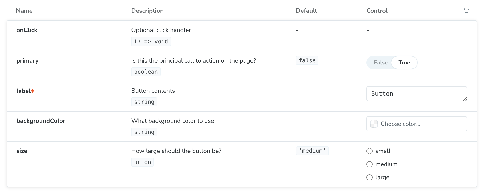
除了通过 parameters.controls 配置 Controls 插件整体功能之外,还可以通过 ArgTypes (opens new window) 配置单个参数的控件类型和功能。
# Highlight
Highlight 插件用于直观地调试你的组件,突出显示 story 中的特定 DOM 节点。这个插件只有一个 disable 配置选项
# Docs
参考 Docs configuration summary (opens new window)
# Measure & Outline
Measure 和 Outline 插件用于检查和直观地调试 story 中的 CSS 布局和对齐问题。这两个插件也只有一个 disable 配置选项
# Toolbars & Globals
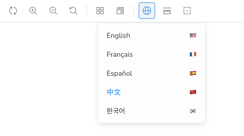
Toolbars 插件用于渲染 Storybook 工具栏 UI,通过它可以选择背景颜色和显示网格(Backgrounds 插件)、改变预览画布的大小(ViewPort 插件)以及测量 DOM 元素的大小和显示 DOM 元素的轮廓。

除了 Storybook 默认的工具栏菜单,Toolbars 插件可以添加新的工具栏菜单。因为它们适用于所有的 story,因此被称为 Globals (opens new window)(全局参数)。
下面添加一个国际化语言的菜单
注意
globalTypes和initialGlobals配置项不在parameters选项里
// .storybook/preview.ts
import type { Preview } from '@storybook/react';

const preview: Preview = {
  globalTypes: {
    locale: {
      description: '国际化语言',
      toolbar: {
        // 有哪些图标可以使用?👇
        // https://storybook.js.org/docs/faq#what-icons-are-available-for-my-toolbar-or-my-addon
        icon: 'globe',
        title: 'Locale',
        dynamicTitle: true,
        items: [
          { value: 'en', right: '🇺🇸', title: 'English' },
          { value: 'fr', right: '🇫🇷', title: 'Français' },
          { value: 'es', right: '🇪🇸', title: 'Español' },
           { value: 'zh', right: '🇨🇳', title: '中文' },
          { value: 'kr', right: '🇰🇷', title: '한국어' },
        ],
      },
    },
  },
  // 默认值
  initialGlobals: {
    locale: 'zh',
  },
};

export default preview;
2
3
4
5
6
7
8
9
10
11
12
13
14
15
16
17
18
19
20
21
22
23
24
25
26
27
28
29
30
通过 Decorators (opens new window) 可以访问全局参数,下面我通过 Decorators 设置 Ant Design 的国际化 (opens new window)
// .storybook/preview.ts
import type { Preview } from '@storybook/react';
import { App, ConfigProvider } from 'antd';
import zh from 'antd/locale/zh_CN';
import en from 'antd/locale/en';
import fr from 'antd/locale/fr_FR';
import es from 'antd/locale/es_ES';
import kr from 'antd/locale/ko_KR';

const locales = {
  zh,
  es,
  fr,
  es,
  kr
}

const preview: Preview = {
  decorators: [
    (story, context) => {
      const selectedLocale= context.globals.locale || 'zh';
      return (
        <ConfigProvider
        	locale={locales[selectedLocale]}
          >
       			<Story />
      	</ConfigProvider>
      );
    },
  ],
};

export default preview;
2
3
4
5
6
7
8
9
10
11
12
13
14
15
16
17
18
19
20
21
22
23
24
25
26
27
28
29
30
31
32
33
# Viewport
Viewport 插件可以修改预览画布的大小,适用于响应式或者手机端开发
Viewport 通过 parameters.viewport 进行配置
默认 Storybook 使用 MINIMAL_VIEWPORTS (opens new window),它只有三个尺寸,我们可以设置为 INITIAL_VIEWPORTS (opens new window)(预设的全部尺寸),甚至还可以添加新的尺寸
// .storybook/preview.ts
import type { Preview } from '@storybook/react';
import { INITIAL_VIEWPORTS } from '@storybook/addon-viewport'

const kindleViewports = {
  kindleFire2: {
    name: 'Kindle Fire 2',
    styles: {
      width: '600px',
      height: '963px',
    },
  },
  kindleFireHD: {
    name: 'Kindle Fire HD',
    styles: {
      width: '533px',
      height: '801px',
    },
  },
};

const preview: Preview = {
  parameters: {
    viewport: {
      viewports: {
        ...MINIMAL_VIEWPORTS,
        ...kindleViewports,
      },
      defaultViewport: 'ipad',
    },
  },
};

export default preview;
2
3
4
5
6
7
8
9
10
11
12
13
14
15
16
17
18
19
20
21
22
23
24
25
26
27
28
29
30
31
32
33
34
# ArgTypes 详解
一般情况下,Storybook 根据组件的参数注释,自动生成 Story 组件参数文档,根据组件参数类型自动推断出 Story 组件参数的控件类型
但是一些特殊情况下,我们可以修改 Storybook 自动生成的参数文档和控件类型
{
  // 组件参数名称
  [key: string]: {
    // 修改参数的名称,一般没有必要
    name?: string;
    /*
    	修改 argType 的语义类型,这个选项用于推断其它属性,如 `control` 和 `table.type`
    	SBType 的类型比较复杂,详见 https://storybook.js.org/docs/api/arg-types#type
    */
    type?: SBType | SBScalarType['name'];
    // 修改参数描述,上图中的 `Description` 列
    description?: string;
    // 根据另一个参数或 global 的值,有条件地显示当前参数
    if?: Conditional;
    // 选项数组,一般用于 `select`、`radio`、`checkbox` 等控件类型.
    // 当该属性有值时,`control` 默认是 `select`
    options?: string[];
    // 将 `options` 映射到别的值
    mapping?: { [key: string]: { [option: string]: any } };
    // 控件类型,看下面的注释
  	// 为 `false` 时,隐藏参数的控件
  	control?: ControlType | ControlTypeObject | false;
    // 参数的文档表格,用于 `ArgTypes doc block`、`Controls doc block` 和 Controls 面板
    table?: {
      // 指定参数的类型,`summary` 通常用于值本身,而 `detail` 用于其他信息,实现效果看下文
      type?: { summary?: string; detail?: string };
  		// 指定参数的默认值,`summary` 通常用于值本身,而 `detail` 用于其他信息,实现效果看下文
      defaultValue?: { summary: string; detail?: string };
  		// 将参数分类,这个是分类名称
      category?: string;
      // 将参数分类,这个是子分类名称
      subcategory?: string;
  		// 该参数只读
  		readonly?: boolean;
      // 不显示该参数
      disable?: boolean;
    },
  }
}

type ControlTypeObject = {
  // 控件类型,见下文
  type: ControlType,
  // 将 `options` 的值映射为 `label`,其实就是修改 `options` 的显示文本
  labels?: { [option: string]: string };
  // type 为 `file` 时有用,表示文件的 MIME types
  accept?: string;
  // type 为 `color` 时有用,表示预设颜色
  presetColors?: string[];
  // 下面三个,当 type 为 `number` 或 `range` 时有用,表示最大值、最小值、步进值
  max?: number;
  min?: number;
  step?: number;
}

type Conditional = {
  // 别的参数或者 `global` 参数,默认是 { truthy: true }
  [predicateType: 'arg' | 'global']: string;
  // 相等
  eq?: any;
  // 不相等
  neq?: any;
  // 定义了(非 undefined 或 null 值)
  exists?: boolean;
 	// truthy,
  truthy?: boolean;
}
2
3
4
5
6
7
8
9
10
11
12
13
14
15
16
17
18
19
20
21
22
23
24
25
26
27
28
29
30
31
32
33
34
35
36
37
38
39
40
41
42
43
44
45
46
47
48
49
50
51
52
53
54
55
56
57
58
59
60
61
62
63
64
65
66
67
# Control Type
| array | 'object' | Provides a JSON-based editor to handle the values of the array. Also allows editing in raw mode. { control: 'object' } |
|---|---|---|
| boolean | 'boolean' | Provides a toggle for switching between possible states. { control: 'boolean' } |
| enum | 'check' | Provides a set of stacked checkboxes for selecting multiple options. { control: 'check', options: ['email', 'phone', 'mail'] } |
'inline-check' | Provides a set of inlined checkboxes for selecting multiple options. { control: 'inline-check', options: ['email', 'phone', 'mail'] } | |
'radio' | Provides a set of stacked radio buttons based on the available options. { control: 'radio', options: ['email', 'phone', 'mail'] } | |
'inline-radio' | Provides a set of inlined radio buttons based on the available options. { control: 'inline-radio', options: ['email', 'phone', 'mail'] } | |
'select' | Provides a select to choose a single value from the options. { control: 'select', options: [20, 30, 40, 50] } | |
'multi-select' | Provides a select to choose multiple values from the options. { control: 'multi-select', options: ['USA', 'Canada', 'Mexico'] } | |
| number | 'number' | Provides a numeric input to include the range of all possible values. { control: { type: 'number', min:1, max:30, step: 2 } } |
'range' | Provides a range slider to include all possible values. { control: { type: 'range', min: 1, max: 30, step: 3 } } | |
| object | 'file' | Provides a file input that returns an array of URLs. Can be further customized to accept specific file types. { control: { type: 'file', accept: '.png' } } |
'object' | Provides a JSON-based editor to handle the object's values. Also allows editing in raw mode. { control: 'object' } | |
| string | 'color' | Provides a color picker to choose color values. Can be additionally configured to include a set of color presets. { control: { type: 'color', presetColors: ['red', 'green']} } |
'date' | Provides a datepicker to choose a date. { control: 'date' }。The date control will convert the date into a UNIX timestamp | |
'text' | Provides a freeform text input. { control: 'text' } |
# 举例
一般情况下使用 Storybook 的自动推断就可以了,但是有些场景还是需要使用 ArgTypes 进行手动修改,下面将列举几个常见的场景
# 枚举
Storybook 能自动推断 small | middle | large 这种字符串常量组成的 Union Types 为 radio 控件,但是无法推断 Typescript 的枚举类型,因此我们就需要手动修改 Typescript 的枚举类型的控件类型,可以是 radio 或者 select 等
// Storybook 推断这种类型为 text 控件
export enum EmptyType {
  NoData = 'NoData',
  NotFound = 'NotFound',
  Developing = 'Developing',
}

// 设置控件类型为 `radio`
const meta = {
  component: Example,
  argTypes: {
  	type: { control: 'radio', options: Object.values(EmptyType) },
  }
} satisfies Meta<typeof Example>;

export default meta;
2
3
4
5
6
7
8
9
10
11
12
13
14
15
16
# 映射
Storybook 只支持能 JSON 序列化的类型,如果是 JSX 或者 DOM 元素,Storybook 无法提供正确的控件,这个时候我们进行映射
const meta = {
  component: Example,
  argTypes: {
    label: {
      options: ['Normal', 'Bold', 'Italic'],
      mapping: {
        Bold: <b>Bold</b>,
        Italic: <i>Italic</i>,
      },
      control: {
        type: "select"
        // 还可以将 `options` 的值映射为 `label`,我觉得没太大的必要
        labels: {
        	Normal: "正常",
        	Bold: "粗体",
        	Italic: "斜体",
      	}
      }
    },
  },
} satisfies Meta<typeof Example>;

export default meta;
2
3
4
5
6
7
8
9
10
11
12
13
14
15
16
17
18
19
20
21
22
23
# 有条件的显示
有时候需要根据另一个参数的值来判断是否现在该参数,可以使用 if
const meta = {
  argTypes: {
    advanced: { control: 'boolean' },
    // Only enabled if advanced is true
    margin: { control: 'number', if: { arg: 'advanced' } },
    padding: { control: 'number', if: { arg: 'advanced' } },
    cornerRadius: { control: 'number', if: { arg: 'advanced' } },
  },
} satisfies Meta<typeof Example>;

export default meta;
2
3
4
5
6
7
8
9
10
11
# 不显示控件
设置 control 为 false,可以去掉参数的控件
const meta = {
  component: Example,
  argTypes: {
    label: {
      control: false
    },
  },
} satisfies Meta<typeof Example>;

export default meta;
2
3
4
5
6
7
8
9
10
# 隐藏
设置 table.disable 为 true,可以去掉参数的控件
const meta = {
  component: Example,
  argTypes: {
    label: {
      table: {
      	disable: true
      },
    },
  },
} satisfies Meta<typeof Example>;

export default meta;
2
3
4
5
6
7
8
9
10
11
12
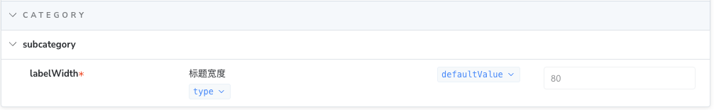
# 自定义 Table 属性
const meta = {
  component: Example,
  argTypes: {
    labelWidth: {
      table: {
        type: { summary: 'type', detail: 'This is type' },
        category: 'category',
        subcategory: 'subcategory',
        defaultValue: { summary: 'defaultValue', detail: 'This is defaultValue' },
        readonly: true,
      },
    },
  },
} satisfies Meta<typeof Example>;

export default meta;
2
3
4
5
6
7
8
9
10
11
12
13
14
15
16
效果如下