# Storybook 搭建组件库文档
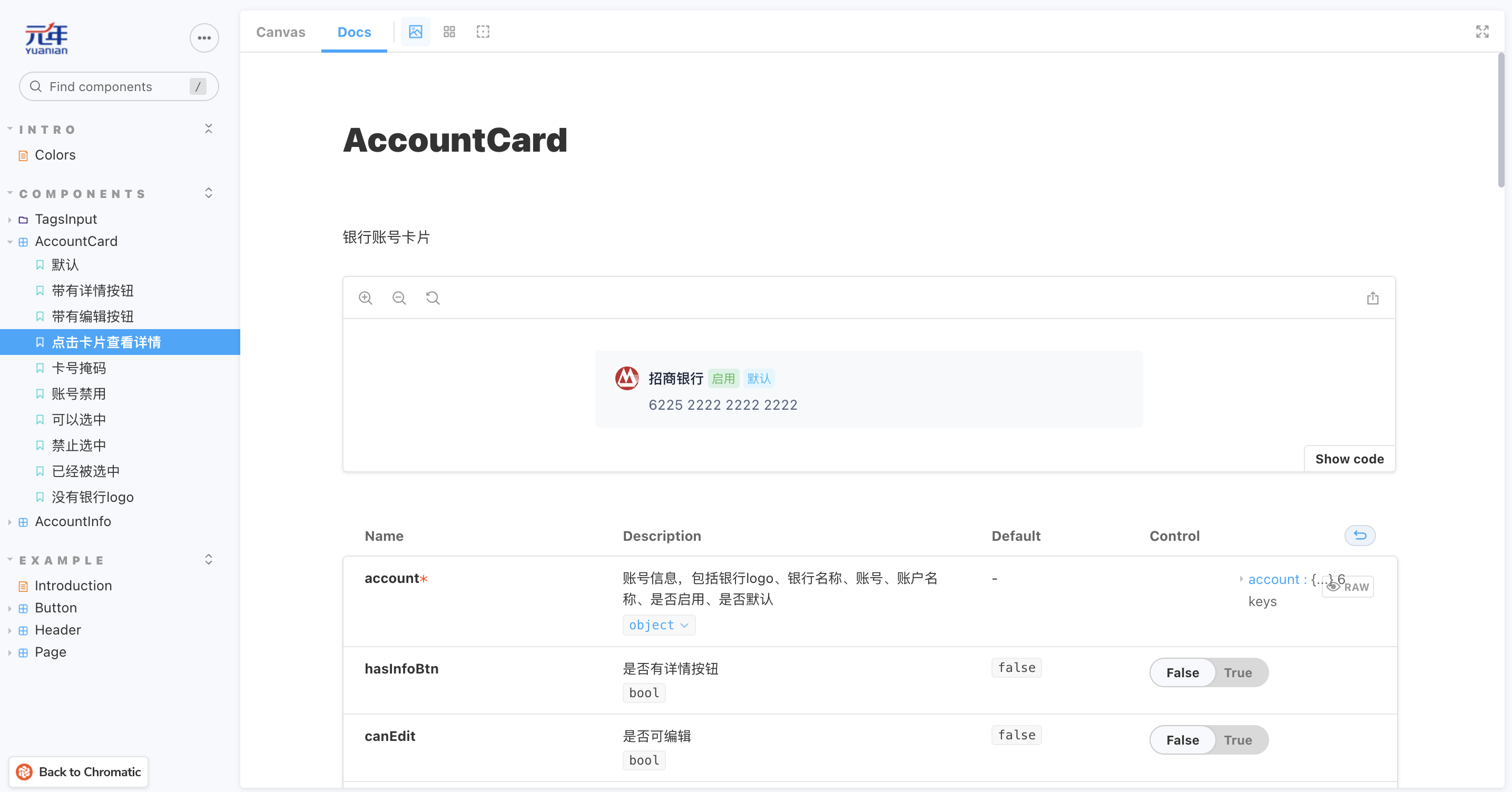
上一篇文章 我们介绍了 Storybook,这篇文章我们将 Storybook 应用到我们的项目中,帮助我们生成组件文档。初级效果如下:
项目技术栈是:Webpack 4.47.0 + React 16.9.0 + Less 3.5.0
# 安装
在工程里使用下面的命令安装 Storybook
$ npx storybook@latest init
Storybook 最新版本 6.5.15
这个命令主要做四件事:
- 安装依赖包和 addons,比如
storybook、@storybook/addon-essentials - 添加 script 命令,比如
"storybook": "storybook dev -p 6006" - 创建配置文件,在
.storybook目录下,有两个文件main.js和preview.js - 创建示例,在
src/stories目录下
# 配置
每个项目都有其特殊性,我们项目也不例外,因此需要一些额外的配置
# 配置 Webpack
Storybook 提供了默认的 Webpack 配置 (opens new window),同时也允许我们通过 .storybook/main.js 来扩展 Webpack 配置。
下面我们将添加 alias 和 less 规则
// .storybook/main.js
const path = require('path');
const root = path.resolve(__dirname, '../');
const src = path.resolve(root, 'src');
const common = path.resolve(src, 'common');
const platform = path.resolve(src, 'platform');
const custom = path.resolve(src, 'custom');
const theme = require(path.resolve(src, 'config/theme'));

module.exports = {
  ..., // 其它配置
  webpackFinal: async (config) => {
    // 添加 alias
    config.resolve.alias['@'] = src;
    config.resolve.alias['@common'] = common;
    // 添加 webpack 规则
    const rules = [
      {
        test: /\.less$/,
        exclude: [platform, custom, common],
        use: [
          'style-loader',
          'css-loader',
          {
            loader: 'less-loader',
            options: {
              sourceMap: true,
              modifyVars: theme,
              javascriptEnabled: true,
            },
          },
        ],
      },
      {
        test: /\.less$/,
        include: [platform, custom, common],
        use: [
          {
            loader: 'style-loader',
          },
          {
            loader: 'css-loader',
            options: {
              modules: {
                localIdentName: '[path][name]__[local]--[hash:base64:8]',
                context: src,
              },
            },
          },
          {
            loader: 'postcss-loader',
          },
          {
            loader: 'less-loader',
          },
        ],
      },
    ];
    config.module.rules.push(...rules);
    return config;
  },
};
2
3
4
5
6
7
8
9
10
11
12
13
14
15
16
17
18
19
20
21
22
23
24
25
26
27
28
29
30
31
32
33
34
35
36
37
38
39
40
41
42
43
44
45
46
47
48
49
50
51
52
53
54
55
56
57
58
59
60
61
62
# 配置 Babel
Storybook 提供了默认的 Babel 配置 (opens new window),但是如果你的工程里存在 .babelrc 文件,Storybook 将使用这个文件来配置 Babel,同时你也可以在 .storybook 目录下创建一个 .babelrc 文件,表示只用于 Storybook 的 Babel 配置,还可以通过 .storybook/main.js 的 babel 属性 (opens new window),修改 Storybook 的 Babel 配置。
可能是我们工程配置的原因,我们生成的 story 没有按我们定义的顺序排列,而是按字母排序的,查阅资料后得知需要安装 babel-plugin-named-exports-order (opens new window),同时添加到 .babelrc
推测原因是使用了
@babel/plugin-transform-modules-commonjs,因为我删除这个之后也能满足 story 按定义的顺序排序。但是项目中使用了它,所以不能轻易删除,以免出现问题
// .storybook/.babelrc

{
  "plugins": [
    "babel-plugin-named-exports-order"
  ]
}
2
3
4
5
6
7
# 添加全局样式
可以在 .storybook/preview.js 添加全局样式
// .storybook/preview.js

import '@style/global.less';
import '@style/basic.less';
import '@style/theme.less';
import '@style/common.less';
import '@style/iconfont/iconfont.css';
import '@style/iconfont/iconfont.js';
import '@style/icon.less';
2
3
4
5
6
7
8
9
# 添加 Context
我们项目使用了 Context (opens new window) 从 app top 注入多言语相关的数据和方法,要模拟这种行为,我们可以使用 Decorators (opens new window),提供 context
ConfigProvider (opens new window) 是 Antd Design context,用于配置国际化、书写方向等
LangProvider 是我们设置多语言的 context
// .storybook/preview.js
import React from 'react';
import {LangProvider} from '@/app/component/connect';
import {ConfigProvider} from 'antd';
import zhCN from 'antd/es/locale/zh_CN';

// mock 多语言方法
const getLanguageText = (key, value) => {
  return value;
};

export const decorators = [
  (Story) => (
    <ConfigProvider locale={zhCN}>
      <LangProvider
        value={{
          defaultLanguage: 'zh_CN',
          languages: [],
          languageData: {},
          getLanguageText: getLanguageText,
        }}
      >
        <Story />
      </LangProvider>
    </ConfigProvider>
  ),
];
2
3
4
5
6
7
8
9
10
11
12
13
14
15
16
17
18
19
20
21
22
23
24
25
26
27
# 配置静态资源
通过 .storybook/main.js 配置静态资源目录,详情请参考 Images, fonts, and assets (opens new window)
// .storybook/main.js

module.exports = {
  staticDirs: ['../public'],
};
2
3
4
5
# 配置 HTML Head
Storybook 允许通过 .storybook/preview-head.html (opens new window) 配置渲染的 HTML head,比如给 HTML head 注入脚本、样式、以及外部资源等,还可以修改 Storybook 的样式,一般是 copy 工程里 public/index.html 的设置。
因为我们项目使用了响应式布局,需要添加一段脚本设置 html 的 font-size
<!-- .storybook/preview-head.html -->
<script type="text/javascript">
  // 略
</script>
2
3
4
同时我们还可以在这里修改 Storybook 本身的样式
<style>
  .sb-show-main.sb-main-padded {
    padding: 16px !important;
  }
  .sbdocs-wrapper {
    padding: 64px 40px !important;
  }
  .sb-show-main #root {
    height: auto;
  }
  .sb-show-main #root > *:first-child {
    height: auto;
  }
</style>
2
3
4
5
6
7
8
9
10
11
12
13
14
# 写 Story
完成上面的配置之后我们就可以写组件 story。
有两种方式写 story,CSF (Component Story Format (opens new window)) 和 MDX,一般推荐使用 CSF
# CSF
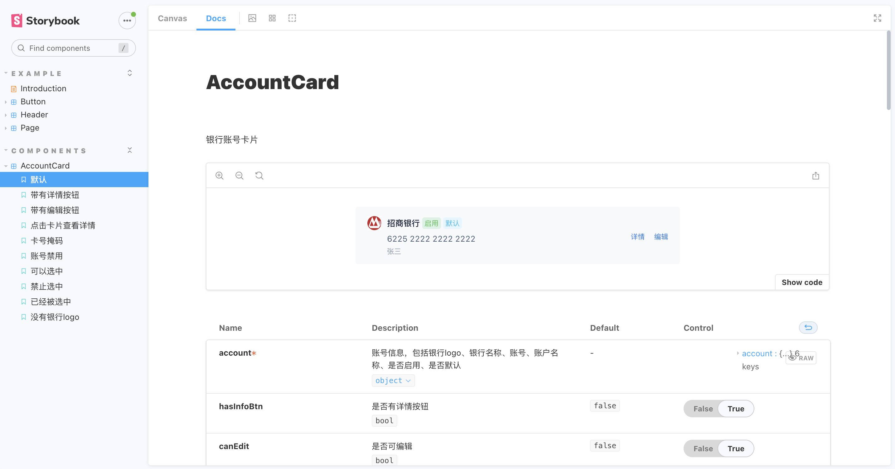
下面是账号卡片组件的 story
import React from 'react';

// AccountCard 是组件
// AccountCardWrapper 是封装了 AccountCard 的 HOC,用于实现多语言
import AccountCardWrapper, {
  AccountCard,
} from '@platform/masterdata/common/accountCard.js';

export default {
  title: 'Components/AccountCard',
  component: AccountCard,
  parameters: {
    layout: 'centered', // 居中布局: padded 默认,放置在top,添加一些 padding; fullscreen 全屏,
  },
  decorators: [(Story) => <div style={{width: 520}}>{Story()}</div>],
};

// Source 中显示组件的名称
AccountCardWrapper.displayName = 'AccountCard';

function Template(args) {
  return <AccountCardWrapper {...args} />;
}

export const DefaultCard = Template.bind({});
DefaultCard.args = {
  account: {
    image:
      'https://img2.baidu.com/it/u=2316535181,20323673&fm=253&fmt=auto&app=138&f=JPEG?w=500&h=500',
    bankName: '招商银行',
    accountNo: '6225222222222222',
    accountName: '张三',
    enable: true,
    default: true,
  },
};
DefaultCard.storyName = '默认';

export const CardWithEditBtn = Template.bind({});
CardWithEditBtn.args = {
  ...DefaultCard.args,
  hasInfoBtn: true,
  canEdit: true,
  showAccountName: true,
};
CardWithEditBtn.storyName = '带有编辑按钮';
2
3
4
5
6
7
8
9
10
11
12
13
14
15
16
17
18
19
20
21
22
23
24
25
26
27
28
29
30
31
32
33
34
35
36
37
38
39
40
41
42
43
44
45
46
# 全局配置 ArgTypes
可以在 .storybook/preview.js 全局配置 ArgTypes,更多详情请参考 Global ArgTypes (opens new window).
比如我要隐藏所有组件的 global 属性(这个属性是通过 context 传入的),可以这样做
// .storybook/preview.js

export const argTypes = {
  global: {
    table: {
      disable: true,
    },
  },
};
2
3
4
5
6
7
8
9
# 组件配置
# 不显示组件某些 args 的 control
更多详情请参考 Controls (opens new window)
export default {
  component: AccountInfo,
  argTypes: {
    className: {
      control: false,
    },
  },
};
2
3
4
5
6
7
8
# 将某些 args 设置为 action
更多详情请参考 Actions (opens new window)
export default {
  component: AccountInfo,
  parameters: {
    actions: {argTypesRegex: '^handle[A-Z].*'},
  },
};
2
3
4
5
6
# 添加 Story 描述
CardWithInfoBtn.parameters = {
  docs: {
    description: {
      story: '使用 `hasInfoBtn` 显示详情按钮,`onView` 查看详情事件',
    },
  },
};
2
3
4
5
6
7
# 把 Doc 放在第一列
// .storybook/preview.js

export const parameters = {
  previewTabs: { 'storybook/docs/panel': { index: -1 } },
};
2
3
4
5
# 写文档
文档分为两种
- 替换 Storybook 自动生成的文档
- 组件或者项目的补充说明
# 替换 DocsPage
在极少数情况下,我们需要替换 Storybook 自动生成的文档。一般的做法是先创建一个 mdx 文件,在这个文件里面不能定义 Meta 元素
Storybook 6.5 没有 Controls 组件
// Button.mdx
import { Canvas, Story, ArgsTable } from "@storybook/addon-docs"

# This is Button documentation

<ArgsTable />

## Stories
### Primary
<Canvas>
  <Story id="example-button--primary" />
</Canvas>
2
3
4
5
6
7
8
9
10
11
12
然后在组件的 story 文件中引入改 mdx 文件,设置 parameters.docs.page
// Button.stories.jsx

import mdx from './Button.mdx';
export default {
  title: 'Example/Button',
  component: Button,
  parameters: {
    docs: {
      page: mdx,
    },
  },
};
2
3
4
5
6
7
8
9
10
11
12
# 补充说明文档
项目中大部分情况都是保留 Storybook 自动生成的文档,如果需要特殊说明(比如使用指南),则可以添加额外的文档
下面是 TagsInput(带 tags 的输入框)的使用指南文档
空行作为分割
import {Meta, Story, Source} from '@storybook/addon-docs';

import TagsInput from '@common/tagsInput/index.js';

<Meta title='Components/TagsInput/Intro' />

# TagsInput 使用指南

TagsInput 支持[受控组件](https://zh-hans.legacy.reactjs.org/docs/forms.html#controlled-components)和[非受控组件](https://zh-hans.legacy.reactjs.org/docs/uncontrolled-components.html)两种方式,同时支持字符串数组和对象数组

## 受控组件

传入 value 和 onChange

<Story id='components-tagsinput--controlled' />

<Source id='components-tagsinput--controlled' />

## 非受控组件

传入 defaultValue 作为默认值

<Story id='components-tagsinput--uncontrolled' />

<Source id='components-tagsinput--uncontrolled' />

## 对象数组

TagsInput 除了支持字符串数组外,还支持对象数组,当是对象数组时,需要传入 `tagName` 表示对象中的哪个属性作为显示文本

<Story id='components-tagsinput--controlled-with-object' />

<Source id='components-tagsinput--controlled-with-object' />
2
3
4
5
6
7
8
9
10
11
12
13
14
15
16
17
18
19
20
21
22
23
24
25
26
27
28
29
30
31
32
33
34
# 定制化
# 主题
现在生成的文档界面使用的是 Storybook 元素,比如 logo,我们需要定制一套属于我们的主题
定制主题,详情请参考 Theming (opens new window)
首先安装 @storybook/addons 和 @storybook/theming
yarn add --dev @storybook/addons @storybook/theming
然后创建主题,包括标题,logo,点击 logo 的跳转URL
// .storybook/yuanian.js

import {create} from '@storybook/theming';
import Logo from './yunian-logo.png';

export default create({
  base: 'light',
  brandTitle: '元年',
  brandUrl: 'https://www.yuanian.com/',
  brandImage: Logo,
  brandTarget: '_blank',
});
2
3
4
5
6
7
8
9
10
11
12
13
最后添加新创建的主题
// .storybook/manager.js

import { addons } from "@storybook/addons";
import YuanianTheme from "./yuanian-theme";

addons.setConfig({
  theme: YuanianTheme
});
2
3
4
5
6
7
8
# Favicon
我们可以通过 .storybook/manager-head.html 来修改 Favicon
<link
  rel="icon"
  href="https://www.yuanian.com/favicon.ico"
  type="image/x-icon"
/>
<link
  rel="shortcut icon"
  href="https://www.yuanian.com/favicon.ico"
  type="image/x-icon"
/>
2
3
4
5
6
7
8
9
10
# 背景颜色
Storybook 提供了两种背景样式:light 和 dark,因为我们项目主要有两种背景颜色,白色和浅灰色,所以我们需要定制我们的背景颜色
定制背景颜色,详情请参考 Backgrounds (opens new window)
// .storybook/preview.js

export const parameters = {
  backgrounds: {
    default: 'white',
    values: [
      {
        name: 'white',
        value: '#ffffff',
      },
      {
        name: 'gray',
        value: '#f5f7fa',
      },
    ],
  },
};
2
3
4
5
6
7
8
9
10
11
12
13
14
15
16
17
# 发布
最后就是发布文档,Storybook 推荐使用自己家的 Chromatic (opens new window),这个是为 Storybook 量身定做的
# Chromatic
发布到 Chromatic 最简单的方式是从 GitHub 导入 repository,但是我们的代码是非开源的,所以不能使用这种方式。
我们使用第二种方式,首先安装 chromatic
$ yarn add --dev chromatic
然后在登录 Chromatic,创建工程,记一下 project-token
$ npx chromatic --project-token=<your-project-token>
然后 Chromatic 运行 build-storybook 命令,然后将 storybook-static 文件上传到 Chromatic
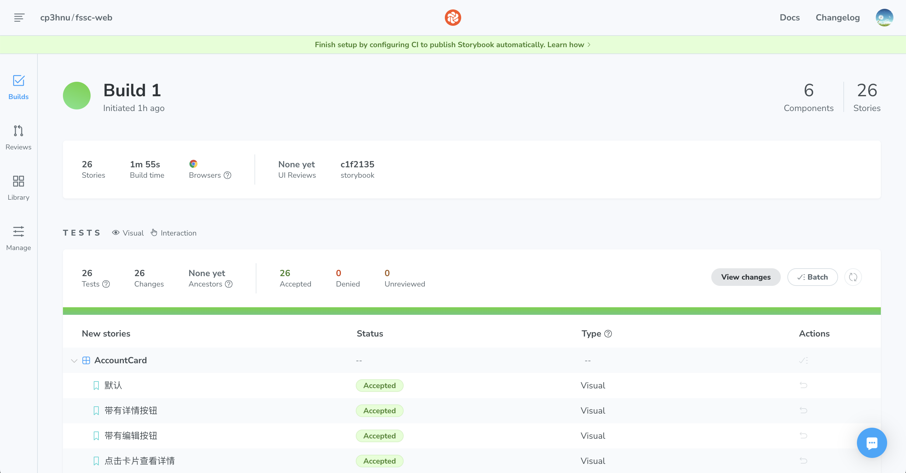
Chromatic 提供了很多高级功能,比如 Visual Tests (opens new window)
点击 "View Storybook",可以查看文档
# Vercel
我们也可以发布到 Vercel (opens new window),同样的原因我们不能从 GitHub 导入 repository,只能手动部署
首先安装 Vercel
$ npm i -g vercel
然后登录
$ vc login
选择 "Log in to Vercel email",输入邮箱,Vercel 会给你的邮箱发送一封验证邮件,点击邮件就能成功登录
再接着运行 build-storybook 命令,编译 Storybook,最后部署到 Vercel
$ npm run build-storybook
$ cd storybook-static
$ vc
2
3
# References
- Storybook (opens new window)
- Component Story Format (opens new window)
- JSDoc (opens new window)
- MDX (opens new window)
- Chromatic (opens new window)
- Storybook Docs Recipes (opens new window)
- CSF Stories with arbitrary MDX (opens new window)
- Jest (opens new window)
- Test-Library (opens new window)
- Chromatic (opens new window)
- Vercel (opens new window)