# Storybook
现在前端开发越来越复杂,组件越来越多,成熟的项目可能包含上百个组件,而每个组件又有很多不同的变化,调试这些组件将是非常繁重的任务。
Storybook 定义每个组件的不同状态为 story。Storybook render 这些 story,并提供很多的 addons (opens new window) 帮助你调试组件、撰写组件文档以及测试组件。
# 安装
在已有的工程里使用下面的命令安装 Storybook
$ npx storybook@latest init
Storybook 会根据你的工程依赖(比如你用的是 React 还是 Vue),提供最优的配置。
这个命令主要做四件事:
- 安装依赖包,比如
@storybook/addon-essentials - 添加 script 命令,比如
"storybook": "storybook dev 6006" - 创建配置文件,在
.storybook目录下,有两个文件main.js和preview.js - 创建示例,在
src/stories目录下
# 升级
$ npx storybook@latest upgrade
运行上面的命令升级 Storybook 相关的包至最新版本,同时检查是否有机会运行自动更新配置
# 自动更新配置
$ npx storybook@next automigrate
# Stories
本文档是在 Storybook 6.5 版本下编写,然后更新到 Storybook 7.4
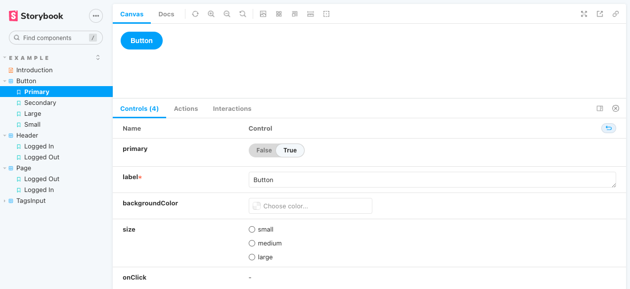
Story 是一个函数,根据不同的 props 返回组件不同的 render 状态。一个组件可以定义多个 story,表示组件的多种 render 状态。 Storybook 通过 Component Story Format (opens new window) (CSF, Storybook 7.4 使用 CSF 3.0) 定义 story。
在 story 文件里,默认导出组件描述,命名导出 story 描述(推荐使用 UpperCamelCase)。
# Args
定义 story 最简单的方式是使用 Args (opens new window)。可以定义全局的、组件的、story 的 args.
// src/stories/Button.stories.jsx
import React from "react";
import { Button } from "./Button";

// 默认导出组件描述
export default {
  component: Button
};

// 命名导出 story 描述
// More on args: https://storybook.js.org/docs/react/writing-stories/args
export const Primary = {
  args: {
    primary: true,
    label: 'Button',
  }
};

export const Secondary = {
  args: {
    label: 'Button',
  },
}

export const Large = {
  args: {
    size: 'large',
    label: 'Button',
  },
}

export const Small = {
  args: {
    size: 'small',
    label: 'Button',
  },
}
2
3
4
5
6
7
8
9
10
11
12
13
14
15
16
17
18
19
20
21
22
23
24
25
26
27
28
29
30
31
32
33
34
35
36
37
Controls addon (opens new window) 通过 Args 可以让你很方便地修改组件的参数,从而方便地调试组件不同的状态
# ArgTypes
Storybook 自动从组件的代码中推断出组件参数的信息,包括参数类型、描述、默认值。
Storebook 的 addons 可以使用这些信息,比如 Controls addon (opens new window) 根据不同的参数类型,提供不同的控制组件。
同时,组件的参数信息也可以通过 ArgTypes (opens new window) 重写,例如
// Button.stories.js|jsx|ts|tsx
export default {
  title: 'Button',
  component: Button,
  argTypes: {
    label: {
      name: 'label',
      type: {
        name: 'string',
        required: true
      },
      description: 'overwritten description',
      defaultValue: 'Button',
      table: {
        type: {
          summary: 'something short',
          detail: 'something really really long'
        },
        defaultValue: {
          summary: 'something short default value',
          detail: 'something really really long default value'
        }
      },
      control: {
        type: 'string'
      }
    }
  }
};
2
3
4
5
6
7
8
9
10
11
12
13
14
15
16
17
18
19
20
21
22
23
24
25
26
27
28
29
其中 table 对应 ArgsTable,详情请参考 ArgsTable Customizing (opens new window)。
control 对应 Controls addon,详情请参考 Controls Annotation (opens new window)。
# Parameters
Parameters (opens new window) 是一组关于 story 的静态元数据,通常用于控制组件或者 story 的特性和 addon 的行为。
和 Args 一样可以定义全局的、组件的、 story 的 Parameters.
例如下面配置 story 的背景色,更多配置项请参考下面的 Configuration
// Button.stories.js|ts|jsx|tsx

import { Button } from './Button';

export default {
  component: Button,
};

export const Primary = {
  parameters: {
    backgrounds: {
      values: [
        { name: 'red', value: '#f00' },
        { name: 'green', value: '#0f0' },
        { name: 'blue', value: '#00f' },
      ],
    },
  },
};
2
3
4
5
6
7
8
9
10
11
12
13
14
15
16
17
18
19
# Decorators
Decorator (opens new window) 包装 story 进行额外的渲染,比如提供全局的 Context (opens new window).
和 Args、Parameters 一样可以定义全局的、组件的、 story 的 decorators. 优先级从高到低依次是 story、组件、全局 decorator,而且 decorators 数组中后面定义的 decorator 比前面定义的 decorator 优先级高。下面定义一个全局的 decorators。
// .storybook/previews.js
import { ThemeContext, themes } from './theme-context';
export const decorators = [
  Story => (
    <ThemeContext.Provider value={themes.dark}>
      <Story />
    </ThemeContext.Provider>
  )
];
2
3
4
5
6
7
8
9
Decorators 的第二个参数是 story context (opens new window).
# Loaders
Loaders (opens new window) 是为 story 和 decorator 加载数据的异步函数。Story 的 loaders 在 story 渲染之前运行,加载的数据通过 story 的 render context 注入到 story 中。
和 Args、Parameters、Decorators 一样可以定义全局的、组件的、 story 的 loaders.
下面通过 remote API 加载 currentUser, 然后通过组件或者 story 的第二个参数 story context (context.loaded.currentUser) 注入到 story 中。
// .storybook/preview.js
import fetch from 'node-fetch';
export const loaders = [
  async () => ({
    currentUser: await (await fetch('https://jsonplaceholder.typicode.com/users/1')).json(),
  }),
];

// Component.stories.js
export const Primary = (args, { loaded: { currentUser } }) => <Component {...args} user={currentUser} />;
2
3
4
5
6
7
8
9
10
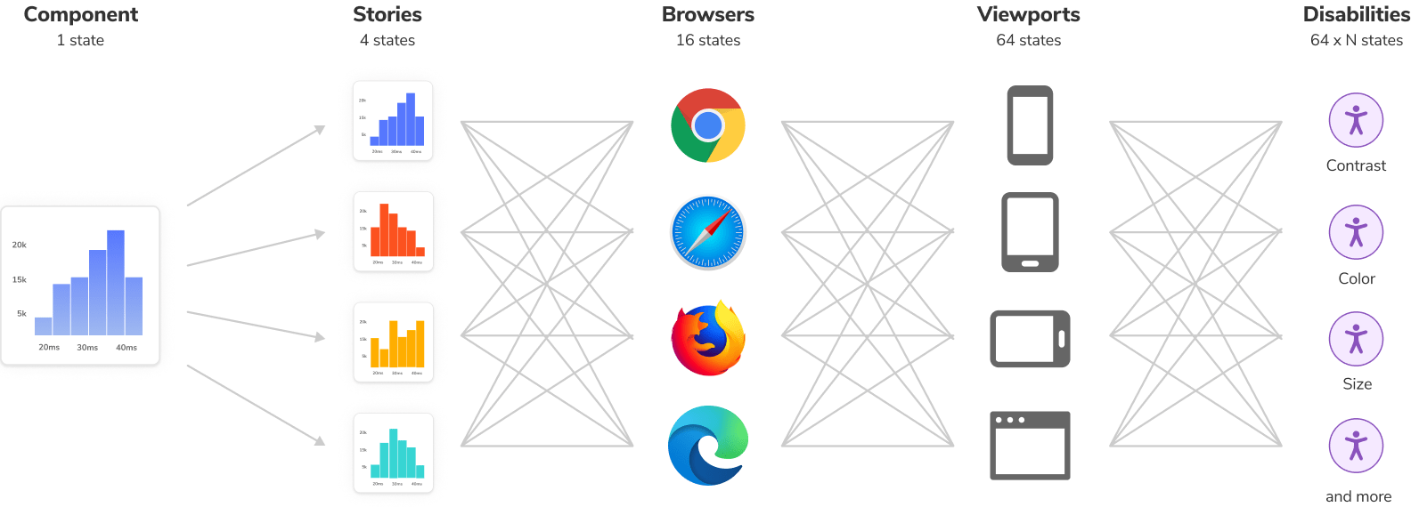
# Naming components and hierarchy
下面是 storybook 的层级结构

可以通过设置 title 设置层级结构
// Button.stories.js|jsx

import { Button } from './Button';

export default {
  /* 👇 The title prop is optional.
   * See https://storybook.js.org/docs/react/configure/overview#configure-story-loading
   * to learn how to generate automatic titles
   */
  title: 'Design System/Atoms/Button',
  component: Button,
};
2
3
4
5
6
7
8
9
10
11
12
# Documents
Storybook 支持两种撰写文档的方法:Autodocs (opens new window) 和 MDX (opens new window)。
# Autodocs
Autodocs 是开箱即用的零配置默认文档。它将 story、文本描述、组件中的 docgen 注释、参数表和代码示例聚合在一起,生成关于组件的文档
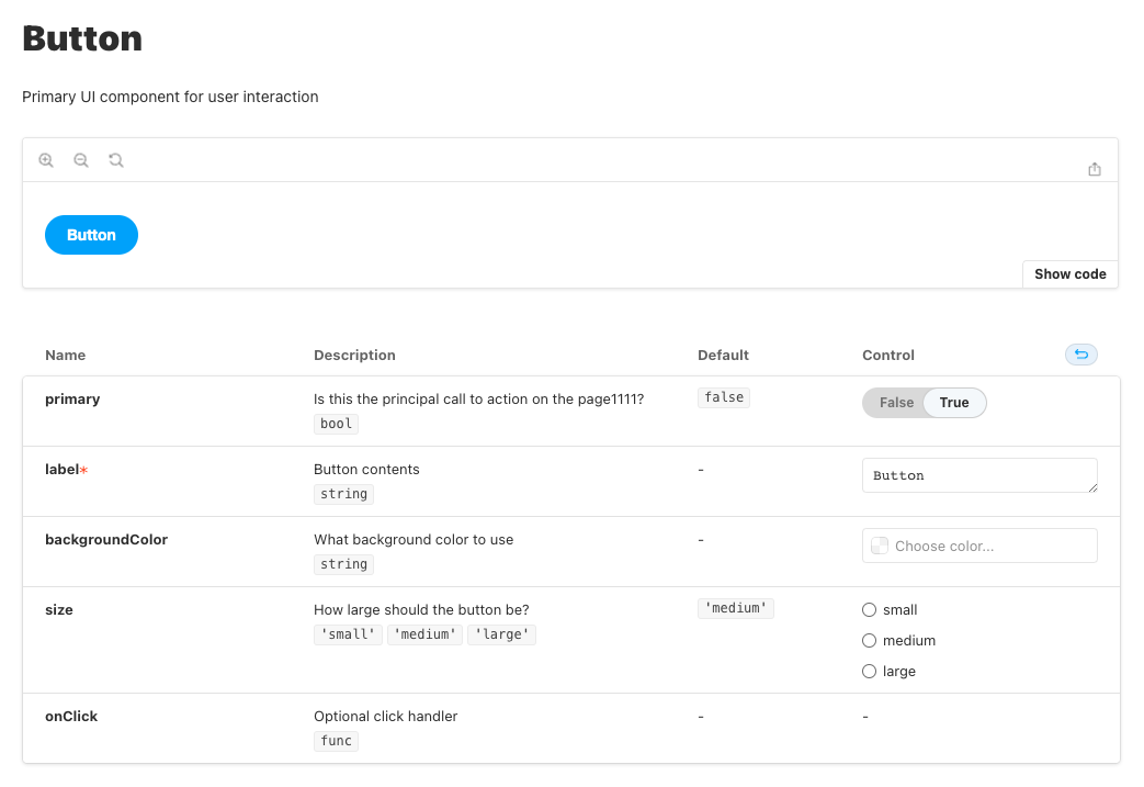
# Overriding description
// 修改组件描述
export default {
  title: 'Example/Button',
  component: Button,
  parameters: {
    docs:
      description: {
        component: 'This is a button',
      },
    },
  },
};

// 修改 stroy 描述
Primary.parameters = {
  docs: {
    description: {
      story: 'This is a primary button',
    }
  }
};
2
3
4
5
6
7
8
9
10
11
12
13
14
15
16
17
18
19
20
21
Doc 注释也能修改 story 的描述
/**
 * This is a large button
 */
export const Large = {
  args: {
    size: 'large',
    label: 'Button',
  },
}
2
3
4
5
6
7
8
9
# MDX
Storybook 默认使用 Autodocs 文档,但是当你想要自定义文档格式或者创建更加详细的文档时,可以使用 MDX。
MDX 是一个 标准文件格式 (opens new window),它结合了 Markdown 和 JSX。
可以在 MDX 中使用 Doc Blocks (opens new window) 来快速构建文档和定义 story。
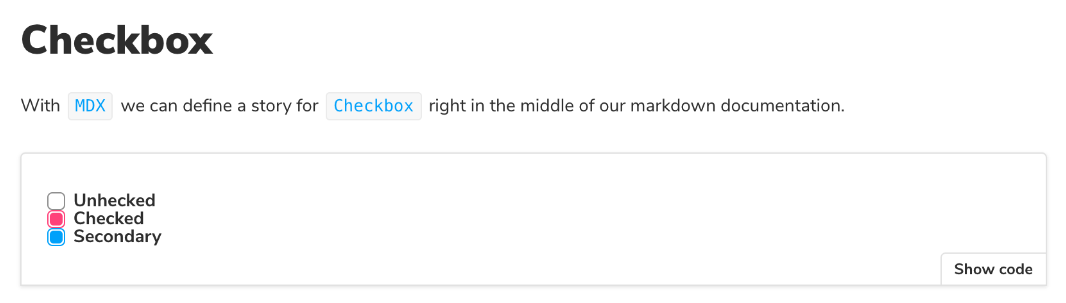
📢:这里官方文档有错,Canvas 里只能有一个 Story,所以需要拆成三个 Canvas
<!-- Checkbox.stories.mdx -->
import { Canvas, Meta, Story } from '@storybook/addon-docs';
import { Checkbox } from './Checkbox';

<Meta title="MDX/Checkbox" component={Checkbox} />
export const Template = (args) => <Checkbox {...args} />;

# Checkbox
With `MDX`, we can define a story for `Checkbox` right in the middle of our
Markdown documentation.

<!-- Stories -->
<Canvas>
  <Story
    name="Unchecked"
    args={{
      label: 'Unchecked',
    }}>
    {Template.bind({})}
  </Story>
</Canvas>

<Canvas>
	<Story
    name="Checked"
    args={{
      label: 'Unchecked',
      checked: true,
    }}>
    {Template.bind({})}
  </Story>
</Canvas>

<Canvas>
	<Story
    name="Secondary"
    args={{
      label: 'Secondary',
      checked: true,
      appearance: 'secondary',
    }}>
    {Template.bind({})}
  </Story>
</Canvas>
2
3
4
5
6
7
8
9
10
11
12
13
14
15
16
17
18
19
20
21
22
23
24
25
26
27
28
29
30
31
32
33
34
35
36
37
38
39
40
41
42
43
44
# Documentation-only MDX
- 当 MDX 文件中没有定义
<Meta>时,该 MDX 文件可以作为 component、story 的文档,详情请参考 CSF Stories with arbitrary MDX (opens new window)
// Button.stories.mdx
import CustomMDXDocumentation from './Custom-MDX-Documentation.mdx';
export default {
  title: 'Button',
  component: Button,
  parameters: {
    docs: {
      page: CustomMDXDocumentation
    }
  }
};
2
3
4
5
6
7
8
9
10
11
- 当 MDX 文件中定义了
<Meta>,但是没有定义 story 时,可以作为该组件的一个文档节点
import { Meta } from '@storybook/addon-docs';
<Meta title="Button/Intro" component={Button}  />

# This is Button introduction
2
3
4
# Embedding stories
通过 <Story id="" /> 嵌入其它 stories
<!-- MyComponent.stories.mdx -->
import { Story } from '@storybook/addon-docs';
# Some header
And Markdown here

<Story id="some--id" />
2
3
4
5
6
# Linking to other stories and pages
通过[title](link)链接到其它 stories 和 pages
[Go to specific story canvas](?path=/story/some--id)
[Go to specific documentation page](?path=/docs/some--id)
2
# Syntax Highlighting
Storybook 的 MDX 自带 Javascript, Markdown, CSS, HTML, Typescript, GraphQL 语言的语法高亮,但是要支持其它语言的语法高亮,需要自己进行扩展,比如使用 react-syntax-highlighter (opens new window).
// .storybook/preview.js
import { PrismLight as SyntaxHighlighter } from 'react-syntax-highlighter';
import scss from 'react-syntax-highlighter/dist/esm/languages/prism/scss';

// Registers and enables scss language support
SyntaxHighlighter.registerLanguage('scss', scss);
2
3
4
5
6
也可以进行 单文件配置 (opens new window)
# Preview and build docs
在 package.json 文件中添加下面两个 script 来 preview 和 build 文档
{
  "scripts": {
    "storybook-docs": "start-storybook --docs --no-manager-cache",
    "build-storybook-docs": "build-storybook --docs",
  }
}
2
3
4
5
6
Build 生成的文件放在 storybook-static 文件夹里
# Docs configuration summary
可以在 MDX 中通过 parameters.docs 来配置文档
export default {
  parameters: {
    docs: {
      page: CustomMDXDocumentation
    }
  }
};
2
3
4
5
6
7
通过官方文档归纳出有以下这些配置项:
| 选项 | 说明 |
|---|---|
| page | 自定义文档或文档模版(在 preview.js 中),可以是一个 MDX 文件或者一个返回 React 组件的函数 |
| description | {component, story},修改组件或者 stroy 的描述 |
| inlineStories | 渲染 story 的方式:true(inline) / false (iframe) |
| prepareForInline | 一个函数,将 story 的内容从给定的框架转换为 React 可以渲染的内容 |
| disable | 禁止 story 出现在 Docs 中 |
| theme | 文档主题色,详情请参考 Theming (opens new window) |
| source | 用于 Source Doc Block,详情请参考 Source (opens new window) |
| controls | 用于 Controls Doc Block,请求请参考 Controls (opens new window) |
| argTypes | 用于 ArgTypes Doc Block |
| canvas | 用于 Canvas Doc Block |
| toc | 文档内容目录,详情请参考 Configure the table of contents (opens new window) |
| container | 自定义文档容器组件,详情请参考 Customize the Docs Container (opens new window) |
| autodocs | 配置自动生成文档,可选值为:true, false, tag,当配置tag时,通过在 story 中添加 tag: ['autodocs']为组件自动生成文档,详情请参考 Configure (opens new window) |
| components | 修改文档中的组件,详情请参考 MDX component overrides (opens new window) |
| subtitle | 副标题,组标题取值 Meta title 属性的最后部分,描述取自组件的 JSDoc 注释 |
# Configuration
Storybook 的配置文件在 .storybook 文件夹里,主要包括下面这些配置文件。
# main.js
main.js 控制 Storybook 服务器的行为,当你修改这个文件之后,必须重启服务。主要包括下面这些配置:
// .storybook/main.js
module.exports = {
  stories: ['../src/**/*.stories.mdx', '../src/**/*.stories.@(js|jsx|ts|tsx)'],
  addons: ['@storybook/addon-essentials'],
  framework: '@storybook/react',
  core: {
    builder: "@storybook/builder-webpack5",
    disableTelemetry: false, // https://storybook.js.org/docs/react/configure/telemetry#how-to-opt-out
    enableCrashReports: true
  },
  staticDirs: ["../public"],
  webpackFinal: async (config, { configType }) => {
    // Make whatever fine-grained changes you need
    // Return the altered config
    return config;
  },
  viteFinal: viteFinal(config) {},
  babel: async (options) => ({
    // Update your babel configuration here
    ...options,
  }),
  typescript: {},
  features: {},
  refs: {},
  env: (config) => ({...config, EXAMPLE_VAR: 'Example var' }),
  logLevel: 'debug'
};
2
3
4
5
6
7
8
9
10
11
12
13
14
15
16
17
18
19
20
21
22
23
24
25
26
27
通过官方文档归纳出有以下这些配置项:
更多详情请参考 Configure your Storybook project (opens new window) 和 Main configuration (opens new window)
| 选项 | 说明 |
|---|---|
| stories | 确定哪些文件为 story 文件,文件的匹配使用 picomatch (opens new window) 支持的语法,详情请参考 Configure story loading (opens new window) |
| addons | 设置 Storybook 加载的 addons (opens new window) 列表 |
| framework | 基于项目使用的框架来配置 Storybook。安装 Storybook 时,它是自动推断出工程使用的框架,目前 Storybook 主要支持这些 框架 (opens new window) |
| core | 配置 Storybook 的内部特性,比如使用哪个构建工具,{ builder: "@storybook/builder-webpack5" } |
| staticDirs | 设置 Storybook 要加载的静态文件的目录列表,详情请参考 Images, fonts, and assets (opens new window) |
| webpackFinal | 定制 Webpack 的配置,详情请参考 Webpack (opens new window) |
| viteFinal | 定制 Vite 的配置,详情请参考 Vite (opens new window) |
| babel | 定制 Babel 的配置,详情请参考 Babel (opens new window) |
| typescript | 定制 Typescript 的配置,详情请参考 TypeScript (opens new window) |
| features | 启用 Storybook 额外的一些配置,详情请参考 Feature flags (opens new window) |
| refs | 配置 Storybook composition (opens new window) |
| env | 自定义 Storybook 环境变量,详情请参考 Environment variables (opens new window) |
| logLevel | 控制日志输出,有这些选项:silly, verbose, info (默认), warn, error, silent |
| docs | 配置 Storybook 自动生成文档,详情请参考 Automatic documentation and Storybook (opens new window) |
# preview.js
preview.js 通过命名导出,来控制 story 怎样被渲染。可以把它当做 Storybook 的入口文件,可以添加全局样式,也可以配置全局 Parameters (opens new window)、Decorator (opens new window)、Loaders (opens new window) 、Globals (opens new window)、ArgTypes (opens new window) 。
# 引入 CSS 文件
// .storybook/preview.js
import '../src/styles/global.css';

export default {
  parameters: {},
};
2
3
4
5
6
# CSS 预处理
如果需要在 Webpack 中使用 Sass, Less,可以使用 addon-styling-webpack (opens new window) 或者修改 storybook 的 webpack 配置。
# Parameters
Parameters (opens new window) 是一组关于 story 的静态元数据,通常用于控制组件或者 story 的特性和 addon 的行为。下面是 Essential addons (opens new window) 的一些配置:
// .storybook/preview.js
import { INITIAL_VIEWPORTS } from "@storybook/addon-viewport";
import CustomMDXDocumentation from './Custom-MDX-Documentation.mdx';

export const parameters = {
  // https://storybook.js.org/docs/react/essentials/controls
  controls: {
    expanded: true,
    matchers: {
      color: /(background|color)$/i,
      date: /Date$/
    },
    presetColors: [
      { color: "#ff4785", title: "Coral" },
      "rgba(0, 159, 183, 1)",
      "#fe4a49"
    ]
  },
  // https://storybook.js.org/docs/react/essentials/actions#automatically-matching-args
  actions: { argTypesRegex: "^on[A-Z].*" },
  // https://storybook.js.org/docs/react/essentials/viewport#configuration
  viewport: {
    viewports: INITIAL_VIEWPORTS
  },
  // https://storybook.js.org/docs/react/essentials/backgrounds#configuration
  backgrounds: {
    values: [
      { name: "red", value: "#f00" },
      { name: "green", value: "#0f0" },
      { name: "blue", value: "#00f" }
    ]
  },
  // https://storybook.js.org/docs/react/writing-docs/autodocs#with-mdx-documentation
  docs: {
    page: CustomMDXDocumentation
  },
  // https://storybook.js.org/docs/react/configure/story-layout
  layout: "fullscreen" // "centered", "fullscreen", "padded"(默认)
};
2
3
4
5
6
7
8
9
10
11
12
13
14
15
16
17
18
19
20
21
22
23
24
25
26
27
28
29
30
31
32
33
34
35
36
37
38
39
通过官方文档归纳出有以下这些配置项:
# GlobalTypes
Globals (opens new window) 是 Storybook 的全局输入,不特定于任何 story。它的一个用途是用于配置额外的 toolbar menus,例如下面创建一个 theme menu:
// .storybook/preview.js
export const globalTypes = {
  theme: {
    name: 'Theme',
    description: 'Global theme for components',
    defaultValue: 'light',
    toolbar: {
      icon: 'circlehollow',
      // Array of plain string values or MenuItem shape (see below)
      items: ['light', 'dark'],
      // Property that specifies if the name of the item will be displayed
      showName: true,
      // Change title based on selected value
      dynamicTitle: true,
    }
  }
};
2
3
4
5
6
7
8
9
10
11
12
13
14
15
16
17
# preview-head.html & preview-body.html
在 Storybook 中,story 是在特定 "preview iframe" 中呈现,如果你想要在 "preview iframe" head 或者 body 中添加额外的元素,比如样式表,可以通过 preview-head.html / preview-body.html。
// font
<link rel=”preload” href=”your/font” />

//js
<script src="xxx.js"></script>

// stylesheets
<link href="xx.css" rel="stylesheet" type="text/css">
<style>
  #app {}
<style>
2
3
4
5
6
7
8
9
10
11
# manager.js
manager.js 控制 Storybook 的 UI,详情请参考 Features and behavior (opens new window)。比如我们可以修改 Storybook UI 的 theme.
首先创建 YourTheme.js 文件
// .storybook/YourTheme.js

import { create } from '@storybook/theming';

export default create({
  base: 'light',
  brandTitle: 'My custom storybook',
  brandUrl: 'https://example.com',
  brandImage: 'https://place-hold.it/350x150',
  brandTarget: '_blank',
});
2
3
4
5
6
7
8
9
10
11
然后在 manager.js 引入这个 theme
// .storybook/manager.js

import { addons } from '@storybook/addons';
import yourTheme from './YourTheme';

addons.setConfig({
  theme: yourTheme,
});
2
3
4
5
6
7
8
# Existing problems
- ArgTypes 没有 Array 数据类型,在 Controls addon 设置值时,默认给的值是
{},导致 Storybook crash。关于这个我提了一个 issue (opens new window). - 在 Canvas tab 不能查看 source code,关于这个我提了一个 discussion (opens new window).
- 自动生成的代码还是存在很多问题
# References
- Storybook (opens new window)
- Component Story Format (opens new window)
- JSDoc (opens new window)
- MDX (opens new window)
- Chromatic (opens new window)
- Storybook Docs Recipes (opens new window)
- CSF Stories with arbitrary MDX (opens new window)
- Jest (opens new window)
- Test-Library (opens new window)
- picomatch (opens new window)
- react-syntax-highlighter (opens new window)